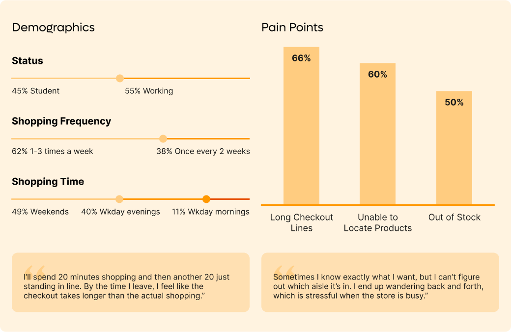


Over a two-week period, I collected 53 survey responses to better understand user behaviors and frustrations with grocery shopping.This research helped me clarify the target audience and identify key challenges to solve, ensuring design decisions were grounded in user needs.


The digital shopping cart syncs with data from user’s mobile app. Thus, mobile wireframes and prototypes are crucial for initial parts of the touchpoint journey.


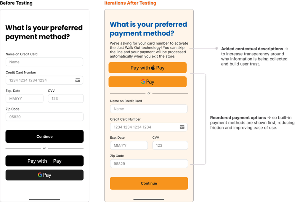
I tested the low-fidelity wireframes with three users and made rapid iterations directly on the high-fidelity wireframes.


Once users mount their phones on the digital shopping cart. The cart will be activated with user’s account data. This activates in-store navigation and auto-checkout from the cart.

Through usability testing, I uncovered repeated feedback on design oversights I hadn’t initially considered. Iterating based on this feedback led to stronger outcomes in the second round of testing, reinforcing the importance of validating designs early and often.
Initially, I scoped the project as a service design journey across multiple touchpoints (e.g., staff interface, email receipts). This quickly expanded beyond the time available. Narrowing down to the MVP taught me how to prioritize features that deliver the greatest impact with the least complexity—an essential skill in real-world product design.
Although I defined basic tokens such as color palettes and typography, a more robust design system would enable consistency and efficiency. With more experience in Figma, I would apply auto-layouts, grids, and reusable components rather than relying on manual adjustments.
“Smart cart” technology is still emerging, with only a few companies (such as Amazon Fresh) testing it in-market. A next step would be researching the technical feasibility, implementation costs, and potential ROI for grocery businesses. Understanding these constraints would ensure the solution is not only user-friendly but also viable from a business perspective.