

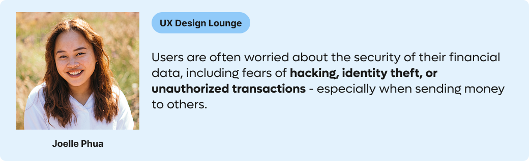
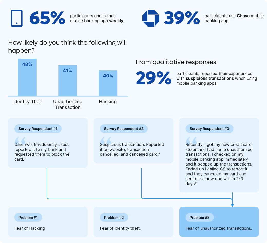
We’ve conducted surveys to understand common insecurities users have when using a banking app and to identify frustrations/pain points people experience when transferring money. We’ve collected a total of 46 responses and were able to narrow down which problem space to solve for.


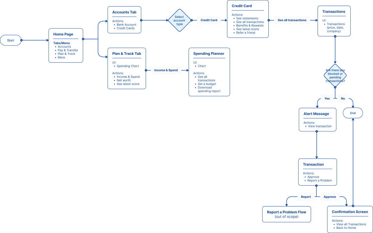
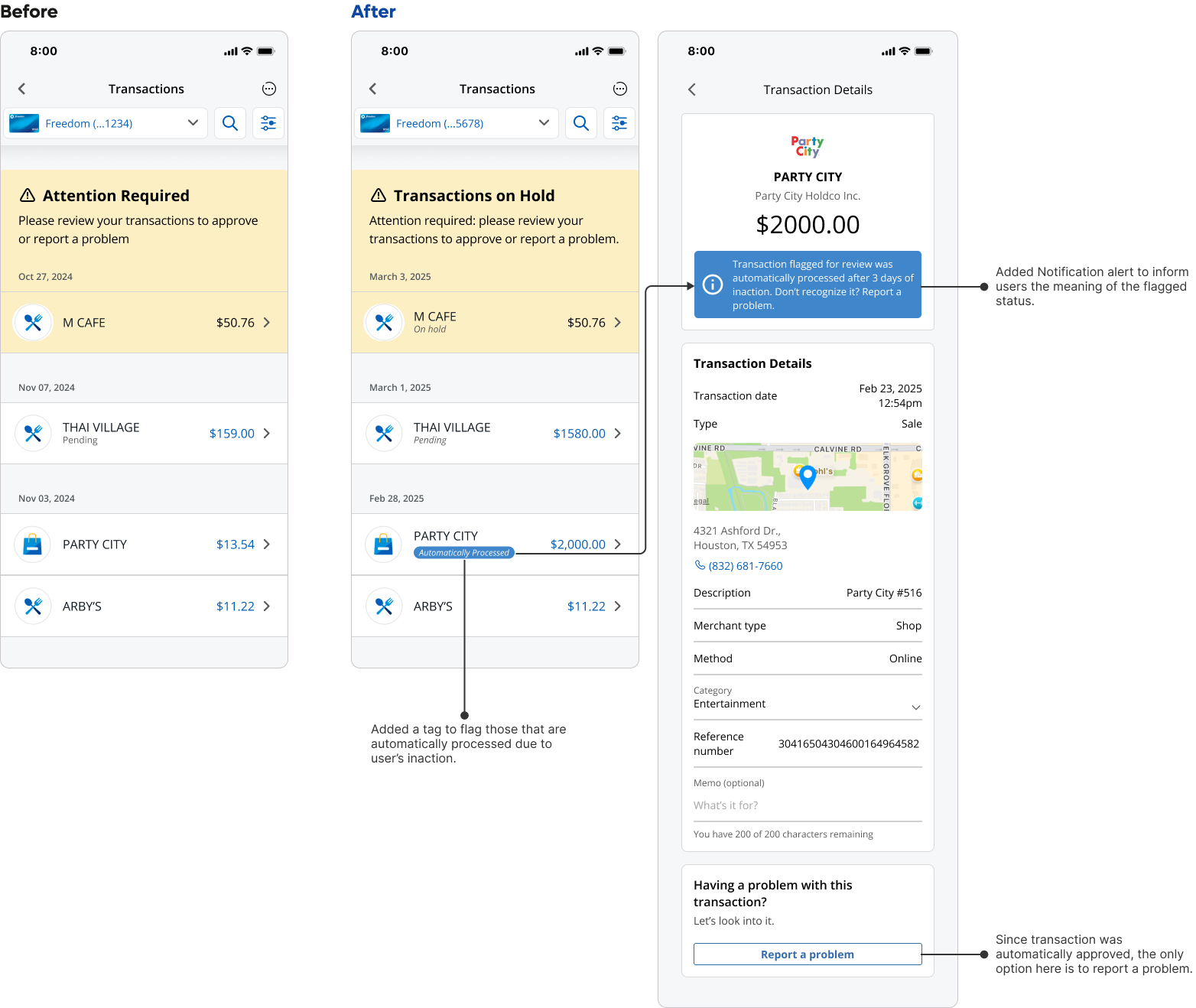
Scenario: User login to check bank statement, noticed there’s a pending transaction.
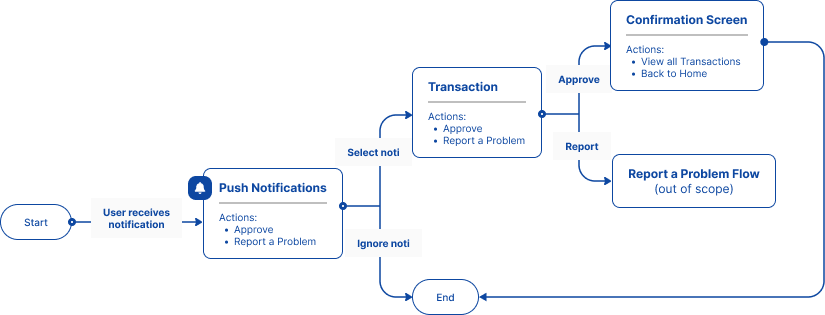
Scenario: Live notification of pending transaction.
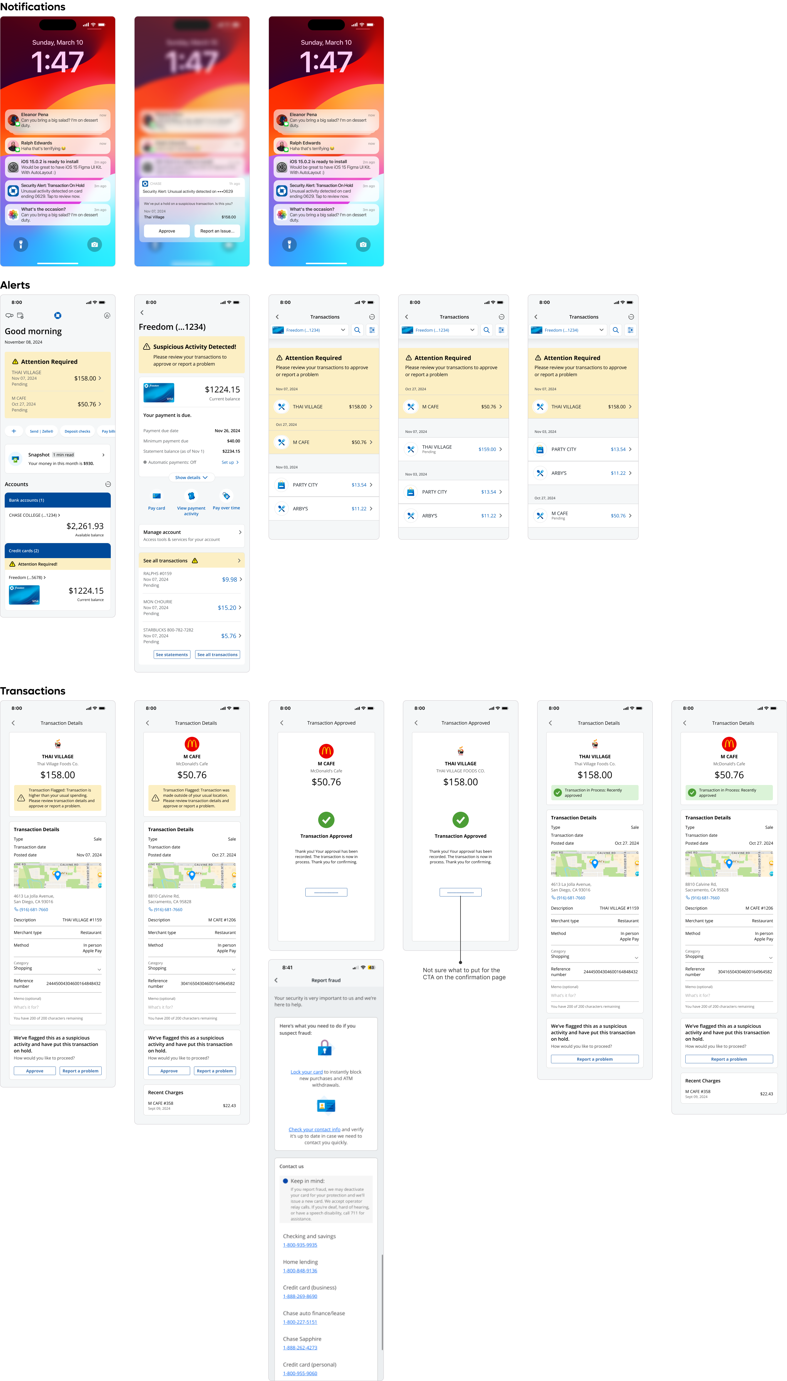
I created wireframes using a mix of Figma community templates and Chase app screenshots to save time. These wireframes allowed me to quickly build a prototype and test key user flows.
Testing revealed a potential loophole—users could overlook pending alerts, preventing vendors from receiving payment. To resolve this, I designed a three-day response window. If no action is taken, the transaction clears automatically (as it does today), while still allowing users to dispute the charge later if it proves unauthorized. This balances fraud prevention with smooth transaction flow
This was my first project outside of school and work where I had complete autonomy over the process. At first, I wasn’t sure where to begin, but I quickly learned the value of starting with discovery—whether through surveys, user conversations, or heuristic reviews. I also realized how critical planning is: while we were collecting survey responses, we used that time for literature reviews and analyzing the current experience. This parallel workflow helped us move faster without sacrificing quality.
Unlike school projects with structured assignments, this project required us to own the process end-to-end. Keeping clear documentation of our decisions, research goals, and iterations proved invaluable when writing the case study months later. Every artifact—from early drafts to final analysis—strengthened the rationale behind our design decisions and made the story more compelling.
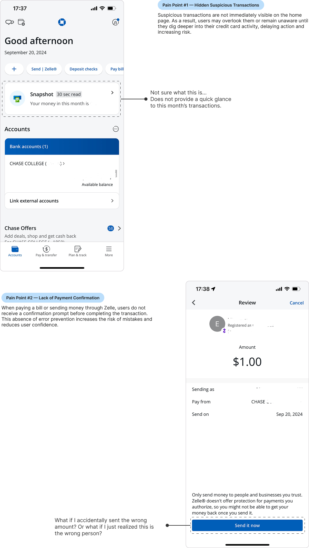
During our heuristic review, we found that the existing “Report a Problem” button redirects users to a resource page instead of taking actionable steps. For users in stressful moments (e.g., unable to call support immediately), this creates friction. Although our project focused primarily on preventing unauthorized transactions, a natural next step would be to design a more guided, self-service reporting flow that empowers users to resolve issues directly within the app.
